
Improving the appointment scheduling experience
in MyChart app during pandemic
for all student groups in UCSD.
Project Overview
My Role
Timeline
Tools
Team Members
Solution
Problem
User Researcher, UX/UI Designer
Jan 2022 - March 2022
(3 months)
Figma, Lucidchart, Qualtrics
Chia-yu Chang, Xiangwen Li, Jinyu Rao
With its disoriented main page and inflexible appointment scheduling process, MyChart creates disabling situations where users are burdened with access to information and lack a sense of support from the school.
It’s disorganized appointment scheduling page also creates a discrepancy between the on-campus and commuting students.
During the pandemic, it is critical for this school-promoted medical management app to show the school's support for all students during this crucial time.
We redesigned the main page, and designed new methods to access the appointment scheduling page. Then, we conducted A/B testing to determine the most natural information navigation route.
We observed and interviewed our stakeholders before redesigning the appointment scheduling process to meet their specific requirements. The revised scheduling approach was more accommodating to commuting students and provided more flexibility in the process.
Find the Stakeholders

UCSD Students
Students are usually occupied by classes and jobs, so quick access to the information they need is important.
As a diverse public university, many UCSD students are out of town or from international. Thus, our design should let all students have a sense of support and welcoming no matter where they are from. A clear guide of location of local facilities is needed during the information navigation process for students who are not local.
Keywords: Quick access, Flexibility, Self-guided
Commuter
At the time of the project, many students are still going to remote classes and live off-campus. Thus, we should consider the flexibility of searching feature in the appointment scheduling page.
Some of the commuter would be students who are under self-isolation due to covid-19 exposure, they would need better self-guided instruction on how to deal with different situation they might face.

&
User Research
1. Survey


2. Direct Observation & In-context interview
Method
By using convenience sampling, we send out the survey link to our friends group and social media.
We used Qualtrics for the survey distribution and result analysis.
Total 16 questions were asked, you can find the survey question here.
Findings
People is not using MyChart as frequently as we thought
About 40% of our participants (25/64) login to MyChart and check MyChart for COVID information once a week, and another 40% of our participants login once a month.
People meets difficulties all the time while using the app
62.5% (40 out of 64) participants reported that they encountered difficulties when accessing covid 19 information on MyChart.
The most used features are all related to appointments scheduling and followups
The most often used feature in MyChart app is to check “Test Result”, which is about 82% (53/64). 57% (37/64) of participants would use MyChart to check and schedule appointments.
2
3
Method
Because of the pandemic, all the participants were asked to participate the interview through Zoom. Participants shared their screen while they interact with the app.
We designed 4 tasks for participants to accomplish:
Login
Find the newest information about Covid-19
Find support if you are worried if you god Covid-19
Schedule a Covid-19 PCR test for next Tuesday
Then, we asked participant to free explore the app and asked some follow-up questions after participants completed the task. The questions are found here.


Findings & Pain points

Disorganized Main Page
Too much unnecessary information presented in the main page at once. Users feel confused and anxious to see the page.
Unhelpful Covid-19 Section
Buttons inside the covid-19 section took users to other external websites, while users was expecting it leads to the test and vaccine scheduling page.
Inflexible Scheduling Process
The appointment scheduling directly took users to the step of choosing specific appointment time. The users have to go back several steps to see which locations they’ve chosen.
Disorganized Appointment Scheduling page
All the types of appointment cluttered in one page. Users need to take long time finding the appointment type they want. Lack information about appointments provided outside of the campus.
1


Solving Pain Points
- Redesign User Flow
Main Page


Appointment Page

Covid-19 Page
Solving Pain Points
- Redesign Prototype


Main Page
To make the main page looks organized, we sorted all the information into 4 sections.
Each section is provided with a short description of its content, so users can find what they need in a second.
Before
After
Covid-19 Section
Appointment Page
Scheduling Process


After
Before

The newest notification will be shown on the top right.
Users can access their vaccination record through main page.
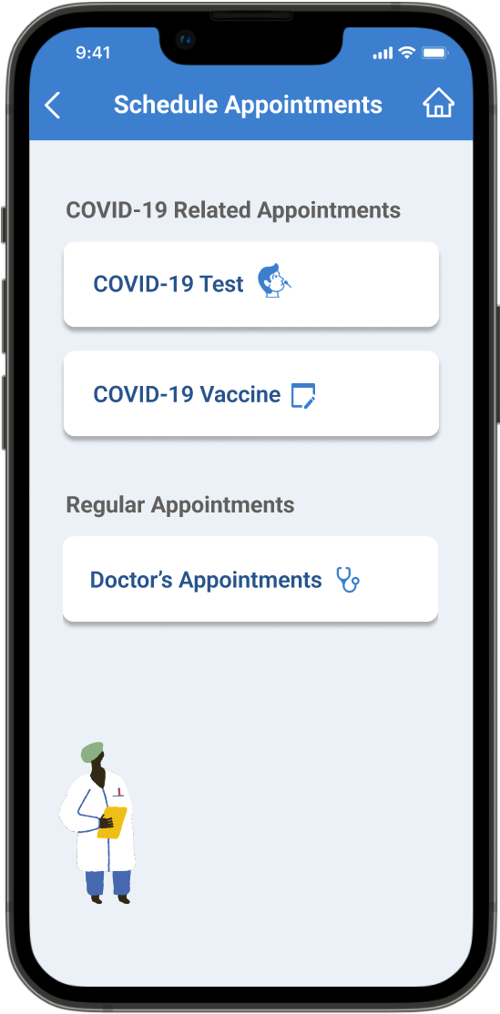
Before redesign, one of the biggest problem with appointment scheduling page was its disorganized option of different appointments.
After redesign, we categorize appointments into covid-19 related appointments and regular appointments. This decision was based on feedback from user survey. Most users using appointment feature to book covid-19 related appointments.
We also added an off-campus test in oder to provide options for students who live far from the campus.
Before
Before redesign, the users can only choose the step one by one, and unable to go back to change the pre-selected options.
After redesign, users are able to choose location, date, and time in one page. They are able to go back easily. The choices they make also appear to them intuitively.
By reducing the number of screen we use, users take less time switching between steps.
Users are also able to change their selection in the confirmation page.
We added a page for selecting covid-19 test type and vaccine type.
During user research, we found that people’s preferences and needs for different types of tests and vaccine affect their final decision.
After
This covid-19 page is a newly added feature.
According to our observations, users tend to find buttons with “covid-19” when they try to schedule a covid test or vaccine. This happens even when they know all appointments are under the appointment section.
In this page, we provided the users one more access to test scheduling and vaccine scheduling page.
Preference Testing


Demo

Scheduling Covid-19 Vaccine
Scheduling Covid-19 Test
Reflection
This is my first design project! Yay! I enjoyed the user research part the most. One difficulty I encountered was the balance between user research and user experience. For example, a longer survey and a longer interview would give us more information to improve user experience. But people also don’t want to take 10 minutes to do a survey. This leads to a difficulty making design decisions. I was not confident of some design decisions because we didn’t have solid data to support them. In the future, I would like to practice how to balance this.